About This Website
BIZ.BIZ Overall Goals
You should read this if you want to learn more about the choices that have gone into this website. This is a longer read that covers visual design, technical implementation, etc. - I encourage you to jump around to the parts that interest you.
This project represents my portfolio, blog, landing page for small projects. I created it both out of an interest in having a personal website, but also as a place to host a small number of other side-projects. The tone of the website is intended to be light-hearted and welcoming. You should feel welcome to click around and explore. This website should showcase my design choices when implementing software - it should be performant, and it should have a clear and uniform user experience. With the overall intentions out of the way, let's dive into the design choices for this site.
https://biz.bizdotbiz.biz/biz/biz.biz is without a doubt my favourite URL on this website.
Lessons Learned
I think the main lession learned here is to simply break the ice. If I want to go back and make things perfect, I need to first start the project. This has been on my to-do list for years now, and here we finally are.
This website is simple and easy to maintain. There is very little in the way of technical wizardry, although I have made choices and trade-offs. This is no capstone project. This website represents what I consider a curated gallery of moments in my life; professional or otherwise.
Visual Design Goals
At the outside, I wanted a website that is clear, simple and acts as a gallery for whatever I choose to put on it. I want to use default design choices whereever possible, and I do not want any animations or transition effects - I want the page to feel function-first. At the core, the purpose of the website is human-centric; I want real humans to be able to see the work I do.
Colour Palette and Visuals
I'm not a designer, so my language will be a bit basic describing my choices, as my visual design choices are quite basic. I wanted something bold, but not distracting. I also stole a design "guideline" that states we want to avoid pure blacks and pure whites as much as possible, so my background is cream and the text is charcoal. I typically enjoy a navy blue, but in this case - I wanted a different look so I chose a Maroon. I used chatgpt to give me several "maroon and cream" colour palettes, I also wanted these colours to also allow for high contrast between the background and the text on the screen for better web accessability (so I gave the tool those constraints.) Developer note: you want the text to be easily legible when the font is not bold, or particularily thick. This means you have enough contrast. While I want each colour to be distinct and capable to working together interchangeably, I have an internal rule that I will avoid placing the maroon and crimson backgrounds too closely together.
User Experience
This means a lot of different things depending on who you ask. For me, this comes down to the question, Can you, as a user with no prior experience, use this website as intended?
For websites, I would say most important related question is, What can I click on?
This is called, Affordance
, in fancy UX jargon. On the web, links are a major affordance element. I keep it as traditional as possible, this is not something that should be changed or innovated upon
unless you have an amazing reason to do so. If something is clickable on this website, it uses a very distinct colour (I used chatgpt for this as well,) has a clear hover effect colour, and is underlined. The one personal rule I bend here is that I use multiple colours to describe clickable things. 99% of the time, I want there to be a singular style for showing users that an element is interactive. It's not a common rule anymore, but one that eventually yields as the types of interactions increases - but this rule is a good starting point for tidy prototyping. Contrast is the big thing here. A better designer would likely pick colours that allow for a single colour to mean clickable. I did not make that design decision, so there is room for improvement.
The following colour samples demonstrate clickable elements. These links are empty and do not open any pages.
Discoverability
The content on this site is designed to be easy to find. There is minimal, repeated navigation to the homepage. You can go to the home page and select a new item. Subpages are kept to a bare minimum. There is only one level of URL heirarchy. I cross link my own content for organic SEO, but outside of that - the goal is to have navigation at the very top and the very bottom of every page.
Mobile-First Web Design
After User Experience, Mobile-first Web Design is the next web development buzzword. Mobile-first simply means that websites are designed with not only mobile devices in mind (back in the day, websites were mostly viewed on computer monitors) but as the first thing you design for. People lie about this one all the time, they simply throw a responsive CSS library or framework on top of things and call it a day. For this site, I largely do the same. My content is mostly text and image, so sprinkling some Twitter Bootstrap on things suits my purposes. You should be able to resize the window and view this on a phone. I developed this on a laptop and did not extensively test the layout on a phone - so for this project Mobile-First is not a decision I went for. I chose Mobile-Friendly. The trade-off is speed, and frankly, the layout is simple enough that I know it'll work. There are currently no major navigation elements and this project is not very interactive. Web 1.0 was originally responsive/mobile-friendly, and I'm sticking as close to that as possible.
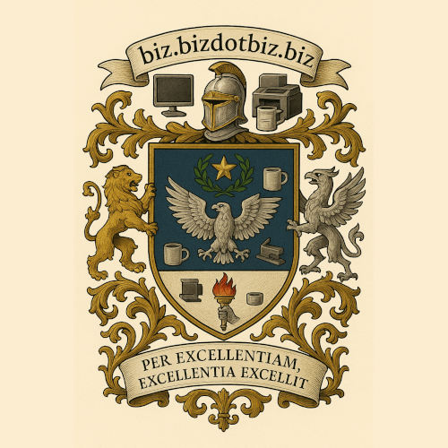
The Logo
The logo shown above is an LLM by-product of the site's latin motto, Per excellentiam, excellentia excellit.
It largely represents the silly, faux-self-important tone of the website, and is a light poke at everyone taking themselves very seriously. I used chatgpt to make the latin more idiomatic, and as a piece of fun I got the tool to generate a simple crest. The results are absolutely stellar, so here it is. The design does not fit in any manner, and has no major thematic connection outside of the coffee mugs and office productivity tools on the crest. The crest, among the other pieces on the website are things I feel are worth sharing over the internet. Per excellentiam, excellentia excellit
, indeed.
Technical Elements
Full stack, as I claim to be, means being able to work on the visual as well as the non-visual elements of the website - the so-called back end.
For BIZ.BIZ, there is no back-end. While built using Laravel, which is more than capable of delivering web applications, BIZ.BIZ is a static site. Each page is hand-written. LLM tools only assist in high-level design or for more creative efforts, when it makes sense.
Accessibility and the Semantic Web
The code for making websites is extremely flexible. You can make a link look and feel like a button, you can make plain text look and feel like a button, etc. I'm simplifying, but The Semantic Web is a concept where you only use buttons to look and feel like buttons. There are reasons why people do not do this, but the Semantic web focuses on intent behind the code being used clear. I mostly follow this convention/concept, if only for screen readers (screen readers are web browsers for real humans with visual impairments) and general browser compatibility. I have no interest in making this website easily digestable by other programs such as LLMs and web scrapers. My underlying hypothesis is that if I keep things as dead simple as possible, browser compatibility does not become a major issue for me. A more accessible web is a better web.
Other Topics
At risk of making this page even longer with details even I consider boring, I think this is enough to be provocative for the right reader. I minify my assets in middleware (css/js notwithstanding as they are not served directly by the application and instead by the web server), and I manage my own hosting (kinda.) Otherwise, ask me about it. Barring that, I can rant about semantic versioning, changelogs, and other details in other projects.
BIZ.BIZ Page Navigation
Your official Call To Action is to wander. Please refer to the navigation links below to continue your journey.